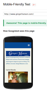
Mobile-Friendly! Building a Responsive Website

Yep, according to Google not only is my new website mobile-friendly, it’s also Awesome! That’s the message I got when I ran my website through a Google program that rated my website for mobile friendliness. In other words, my website will respond to whatever device the reader is using. I now have what is called a responsive website which in turn means it is phone friendly in landscape or portrait. But it is also desktop friendly and tablet friendly, too. What does this mean? If you look at my website using a desktop, you get the full screen version which means the menu is across the top rather than a hidden drop down. The content also stretches across the screen. If you look at my website on a tablet, the pages are a little narrower and the menu is still across the top, but in tablet portrait, the menu shifts into a drop down mode. The phone mode is the most obvious change. Here, the images and content shift into more of a list mode although the text remains the sa...