Mobile-Friendly! Building a Responsive Website
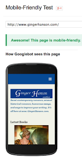
Yep, according to Google not only is my new website mobile-friendly, it’s also Awesome! That’s the message I got when I ran my website through a Google program that rated my website for mobile friendliness. In other words, my website will respond to whatever device the reader is using. I now have what is called a responsive website which in turn means it is phone friendly in landscape or portrait. But it is also desktop friendly and tablet friendly, too.
What does this mean?
If you look at my website using a desktop, you get the full screen version which means the menu is across the top rather than a hidden drop down. The content also stretches across the screen.
If you look at my website on a tablet, the pages are a little narrower and the menu is still across the top, but in tablet portrait, the menu shifts into a drop down mode.
The phone mode is the most obvious change. Here, the images and content shift into more of a list mode although the text remains the same size and is easy to read. As you probably know, the three white lines in the right hand corner signifies the drop down menu.
I started studying responsive sites over a year ago when I realized how tiny my website looked on a phone. To read even a paragraph, the page had to be sized up and the images were lost. Since I’m a writer, I checked out websites designed by or for my fellow authors to see if they were responsive. And if they were, how did they look on various size screens?
You can do this easily on the full screen of a desktop or laptop. How do you tell a screen is responsive? Well, all you have to do is place the cursor on the right the side of the website screen and push it smaller. If the content on the right side disappears, it’s not responsive. If content rearranges itself to the size of the screen, it’s responsive.
Think Content Containers
The information or content you want to share is inside a container. On the desktop screen, you may have three or four containers of information, but as the screen shrinks, the containers drop down or stack into a vertical line to fit on a phone. Part of learning how to build responsive sites, is learning how the containers will fall so the information or images will stack up the way you want.
As I’ve mentioned ad nauseam, I’m a Mac user. This means I use Mac software to design my websites. I’ve been using RapidWeaver by RealMac for almost 10 years. RapidWeaver is the hub of a huge community of developers who make all kinds of neat add ons for this program. Everyone from the RealMac family to the independent contractors of RapidWeaver apps are super helpful.
Learning how to build this type of website didn’t happen overnight, but I went through a learning curve building my first website, too. Since you’re dealing with the containers I mentioned earlier, you have to throw out preconceived notions of how to arrange your content. This means images, since book covers are an important part of our world, and text.
Once I absorbed the concept of responsive websites, I decided to use my then current
website as the first building block of a responsive website. Basically, I simplified the website to better fit the container concept.
Why Responsive?
Why are responsive websites a big deal? First of all, an increasing number of people use their phones more than a laptop or desktop computer. If you don’t want to lose a large chunk of your reading audience, you need to join the responsive crowd.
Second, Google recently announced it was going to give responsive websites top billing on its search engine. Since Google pretty much owns the search engine world, again you’re setting yourself up to lose readers if your site isn’t responsive.
Every author needs to acquaint him or herself with how responsive websites work because even if you don’t build your own website, you have to provide the content. Many popular authors have responsive sites now. Check them out. See how they arrange their information. Grab any ideas you think might work for your website to share with your web designer or to use yourself if you’re redesigning your website.
After you build it, be sure and run it through the Google Mobile-Friendly test. It's always nice to know when someone thinks you're Awesome!


Nice information on responsive website design. Thanks for sharing the post.
ReplyDeleteResponsive Web Design Indore